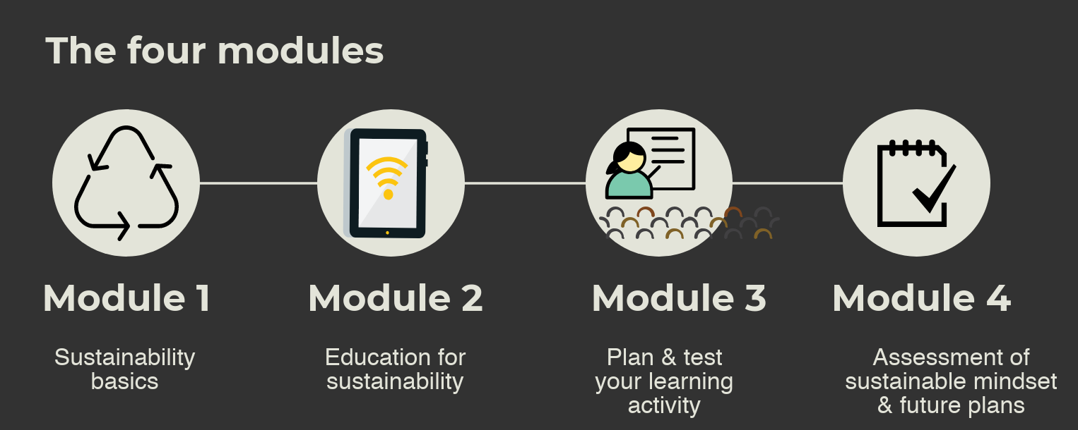
Could showing a curriculum in graphic format reach a wider audience?
In the Prof E Sus project we have been developing and piloting a course, Discovering a Sustainable Mindset, for home economics teachers and trainers to help them promote sustainable ways of working in their learners. Our second major product was a curriculum document designed to convince a university programme board to run the course. (The first was the ESD Resources Directory).
Shelley Terrell’s recent post about presenting your curriculum graphically inspired me to try this out in Piktochart. The result is below. So how about this? Does it tell you all you want to know to get a rough idea of what the course is about?


